about my work verastem’s corporate website
I worked on the Verastem Oncology corporate website while contracted through Robert Half, supporting IQVIA as the agency partner leading the engagement. I was tasked with revising the homepage user flow to strategically funnel visitors toward trust-building content and deeper company information, helping establish confidence in advance of their new product launch.
Working within the existing visual framework, I enhanced readability, clarified text hierarchy, and streamlined content structure to improve usability and engagement. I prioritized a fully responsive experience across desktop, tablet, and mobile, delivering tightly structured, auto-layout Figma files built with development efficiency in mind. Operating on a compressed two-month timeline, I focused on practical, easy-to-implement solutions—providing dev-ready files and scalable components that enabled the engineering team to execute quickly while maintaining consistency, performance, and design integrity. See the before & after below.
AUG 2025-SEPT 2025
key responsibilities:
user experience
client collaboration
prototyping
responsive design
deliverables:
design documentation
high fidelity mockups & prototypes
asset library repository
style guide
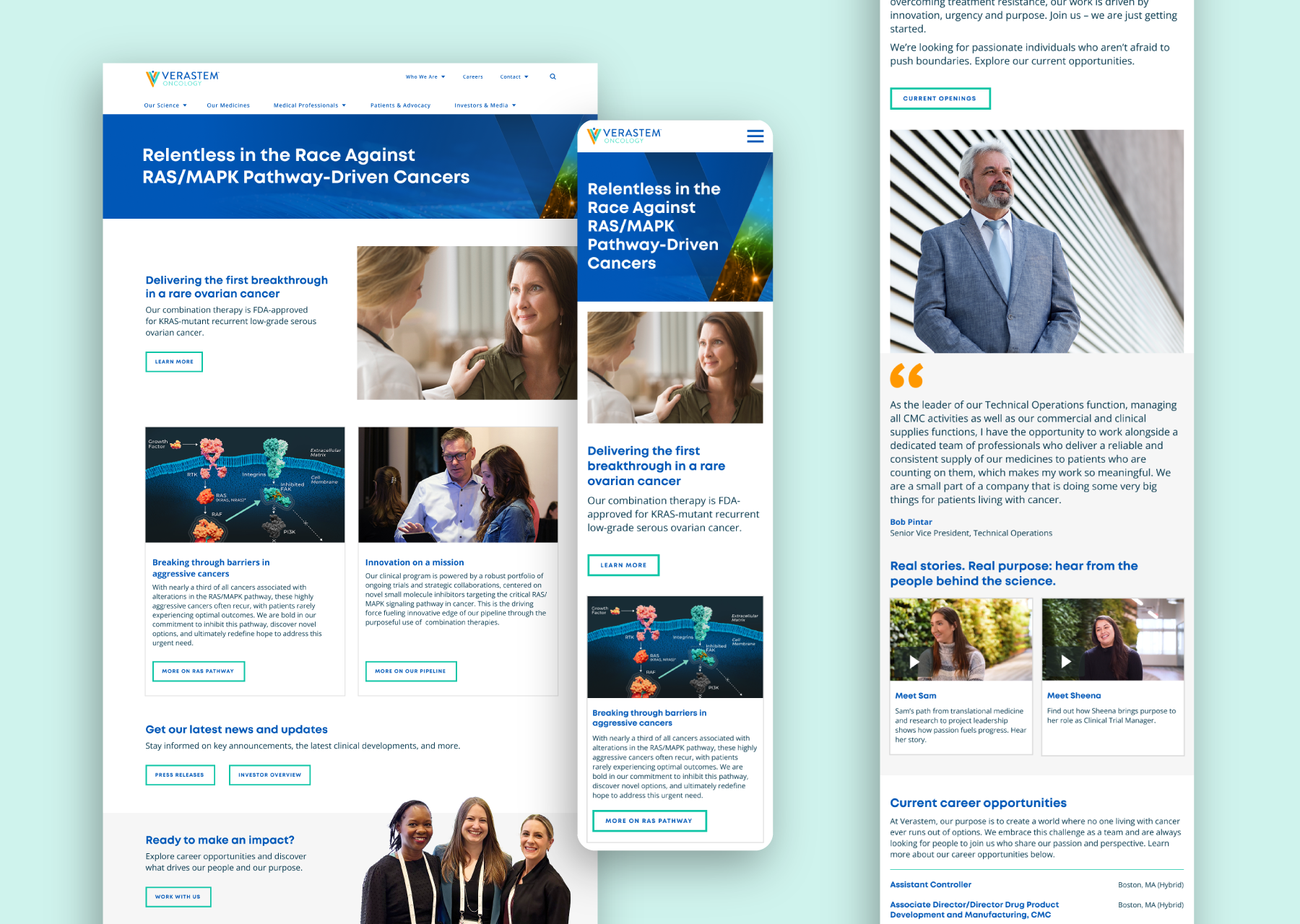
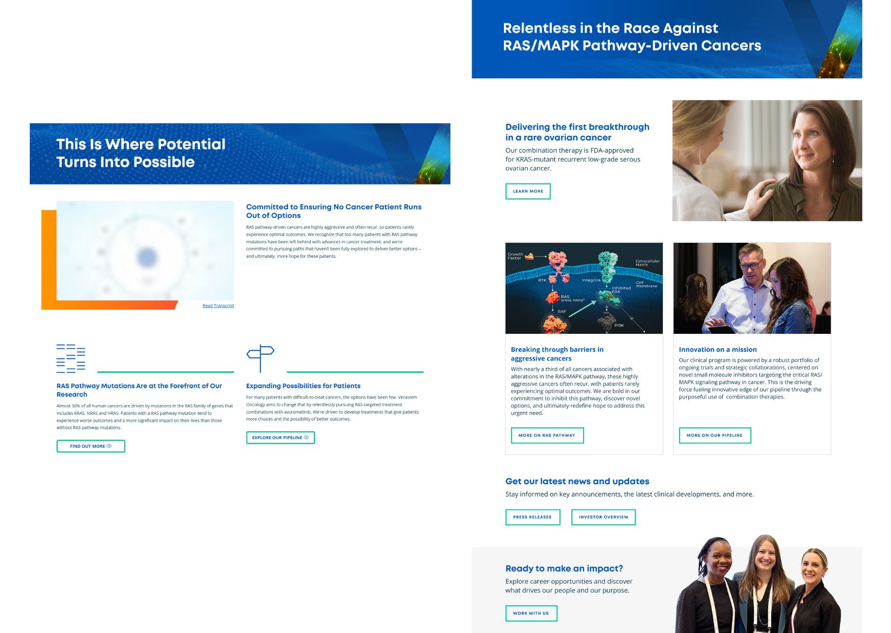
Before & After: The homepage, before (left) and after (right). The old layout (left) felt sparse, with inconsistent spacing and limited visual hierarchy. The page lacks warmth and was text-heavy, with minimal visual elements to engage visitors. On the new layout (right), the design the design is visually engaging and balanced. It utilizes imagery, hierarchy, and clear calls to action to guide the user smoothly through the page.
User experience considerations I had when designing this home page layout:
Strong, specific headline that immediately clarifies the company’s mission and focus.
Multiple cards/sections visually break up the content, improving scannability.
Every major block features a relevant, high-quality image; these provide context and human connection.
Clear, frequent CTAs; buttons are visually distinctive, guiding the visitor’s next step logically down the page.
Additional engagement opportunities (“Press Releases,” “Investor Overview,” “Work with Us”) make the site feel active and dynamic.
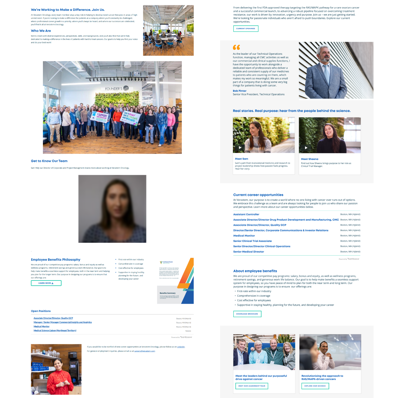
Before & After: The homepage, before (left) and after (right). In the old layout (left), Content is present but visually fragmented, with a lot of vertical scrolling, underutilized space, and limited interactivity. It feels static and less inviting. On the new layout (right), I wanted the page to feel lively and connected, with a strong narrative flow, richer stories, visually engaging cards, and accessible career navigation.
User experience considerations I had when designing this “about us” page layout:
Card-based design distinctly separates and organizes each content block.
Employee voices and stories are emphasized through photos and video, increasing trust and motivation.
Shorter paragraphs, concise bullet points, and boxed sections improve skimmability and scanning.
Larger, more readable fonts, improved contrast, and accessible buttons.