verastem oncology: one website refresh + two new Websites
the challenge: revamp the current corporate site and launch two new product sites
Verastem needed a cohesive digital presence that could build corporate credibility while also supporting the launch of a new oncology product. The challenge was to create 3 connected but distinct experiences for corporate visitors, patients, and healthcare professionals. Each website required different information needs, levels of clinical knowledge, and regulatory requirements.
my solution: build a shared Figma library for efficient handoff, responsive scaling, and distinct patient/provider experiences
Supporting the agency IQVIA, I built a shared Figma component library that kept the experience consistent, accessible, and easy to scale across web and email. The system included reusable components, responsive variants, and clear usage guidance, while allowing the patient and provider sites to feel intentionally different through color, information density, and CTA treatments. Updates could be made once and applied across page variants, helping the team respond quickly to last-minute client requests, streamline dev handoff, cut cycle time by 40%, and reduce designer–developer iteration by 60%.
august 2025-current
key responsibilities:
ux/ui
responsive design
email design
developer handoff
deliverables:
high fidelity mockups & prototypes
asset library repository
style guide & documentation
live links to check out:
verastem.com: the corporate site
avmapki fakzynja: patient site
avmapki fakzynja: provider site
new patient and healthcare professional sites
The patient website and the healthcare professional (HCP) website for Avmapki Fakzynja Co-Pack are each designed around the distinct goals and needs of their respective audiences, with each having clearly differentiated information architecture.
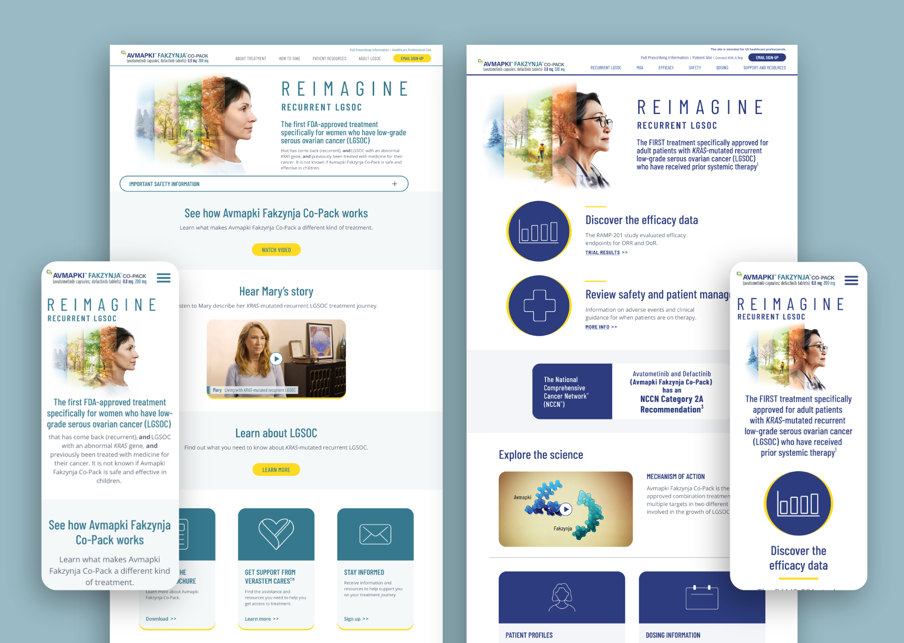
Patient Site architecture:
Linear flow: The patient site uses a straightforward, step-by-step structure to minimize cognitive load and help users easily find essential info.
Simple top nav: The navigation is grouped around patient concerns: About Treatment, How to Take, Patient Resources, About LGSOC (Low-Grade Serous Ovarian Cancer), with clear action items like “Email Sign-Up.”
Support and education: Homepages and key sections lead with reassurance, stories, explainer videos, FAQs, downloadable patient guides, and support services.
Prominent safety info: Safety is persistently emphasized via banners and repeated ISI content, supporting both comprehension and regulatory compliance.
Call-to-action oriented: Each step encourages next actions, whether learning, downloading, or contacting support, with minimal distractions.
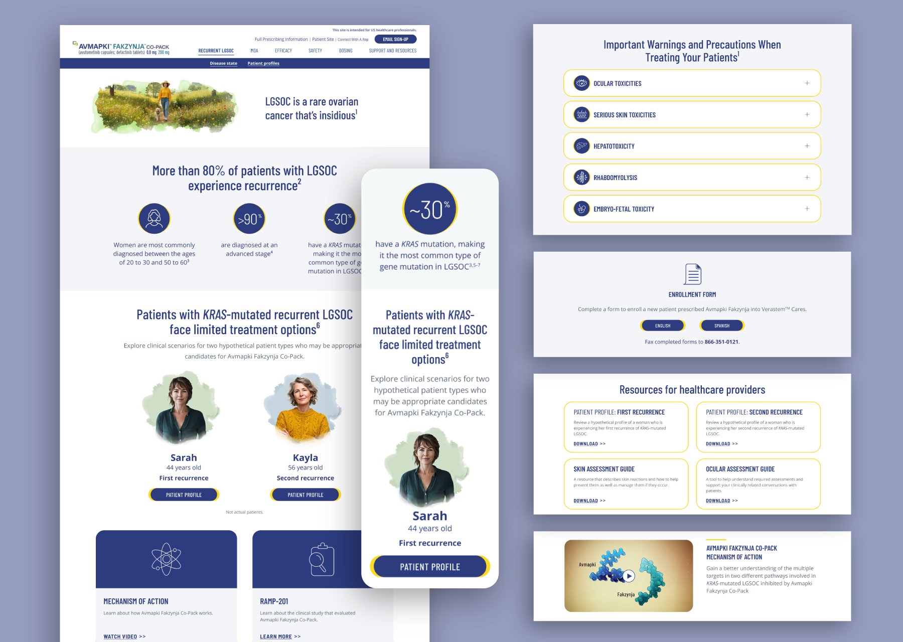
healthcare provider site architecture:
Reference-first, deep content: The HCP (health care professional) site is optimized for rapid access to detailed, clinical information with denser content per page and cross-linking for reference use.
Functional nav: The nav bar maps directly to clinician workflows. This mirrors the way an HCP would look up or reference clinical information.
Expandable, data-rich sections: Dense tables, charts, warnings, side effect details, and downloadable documents are prioritized, supporting complex decision-making for HCPs and their patients.
Regulatory & clinical emphasis: ISI (Important Safety Information), references, indications, and footnotes are integrated throughout, often at the top of page or locked in view, per regulatory demands.
Distinct segmentation: Patient resources and HCP tools are distinctly separated, ensuring clarity between what to share with patients and what drives clinical action.
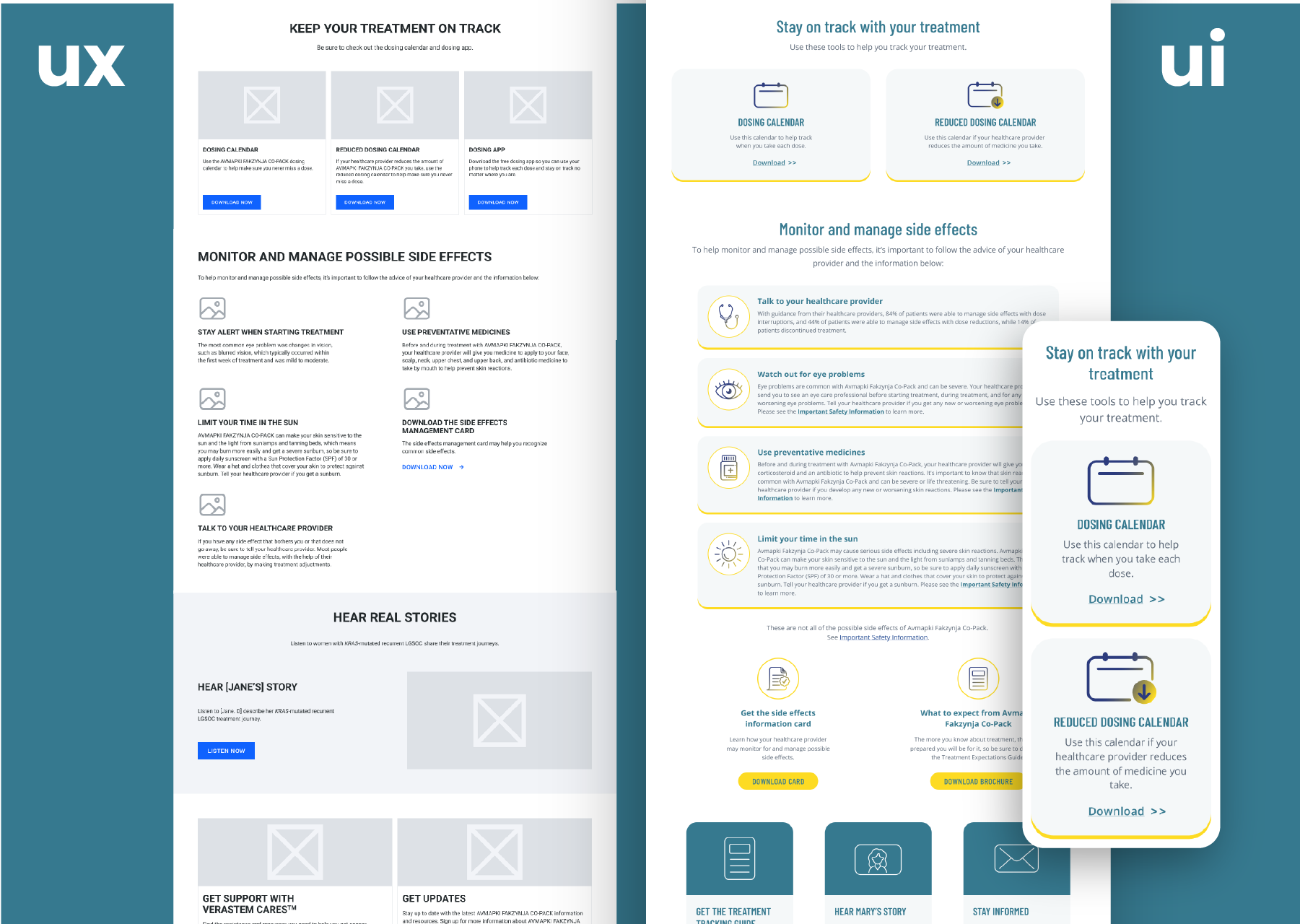
my findings: a thoughtfully considered figma library can save the day
To support both the patient and healthcare professional sites, I built a shared Figma component library that created a single source of truth across the full digital experience. The library included reusable layouts, typography styles, color tokens, buttons, cards, navigation patterns, responsive components, and page-specific variants, making it easier to maintain consistency while still allowing each site to serve its distinct audience needs.
This system helped the team move quickly during a fast-paced, client-driven process. When last-minute content, color, or layout decisions came in, updates could be made once in the library and applied across desktop, tablet, and mobile designs. It also made real-time collaboration and ideation easier for the agency team, while giving developers clear, reusable specs.
Corporate site refresh
verastem.com
The first of the three sites was a refresh of an existing site, aimed at collecting prospective patient data and creating trust ahead of the new drug’s launch.
Operating on a compressed two-month timeline, I focused on practical and easy-to-implement solutions. Providing dev-ready files and scalable components enabled the engineering team to execute quickly while maintaining consistency, performance, and design integrity
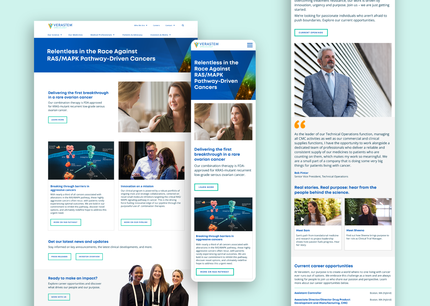
Working within the existing visual framework, I enhanced readability, clarified text hierarchy, and streamlined content structure to improve usability and engagement. I prioritized a fully responsive experience across desktop, tablet, and mobile, delivering tightly structured, auto-layout Figma files built with development efficiency in mind.
home page
before & after
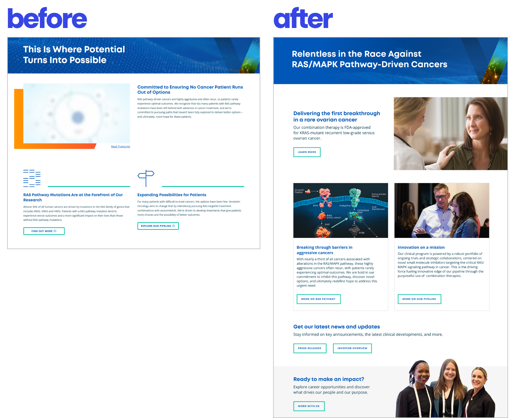
Before: underdeveloped and didn’t build trust
After: story-driven, scannable, and credible
The original homepage introduced Verastem’s mission, but the experience felt sparse, with limited visual hierarchy, minimal imagery, and few clear pathways for users to continue exploring.
In the redesign, I restructured the page into a more engaging, story-driven experience with stronger messaging, purposeful imagery, scannable content cards, and clearer CTAs that guide visitors toward key areas like the RAS/MAPK pathway, pipeline information, press releases, investor content, and careers.
careers page
before & after
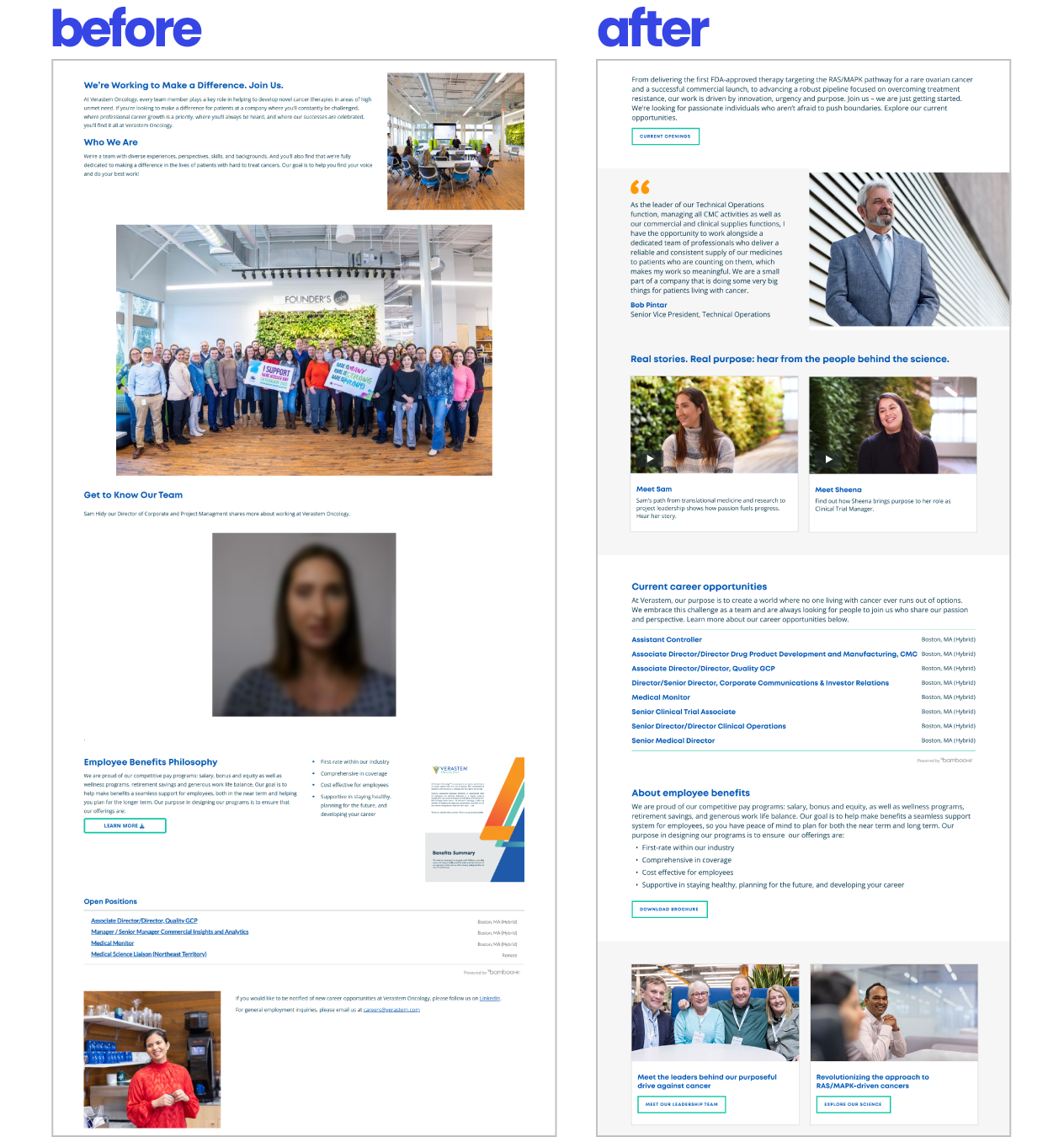
Before: a sparse, text-heavy page
After: a structured and engaging experience with clearer content hierarchy, stronger visual rhythm, and more intentional user pathways
The updated layout breaks content into scannable sections, introduces testimonial and video cards to create a stronger human connection, and uses clearer CTAs to guide visitors toward key actions like viewing openings, learning about benefits, meeting leadership, and exploring the science. Overall, the new experience feels more credible, accessible, and purpose-driven while making career-related information easier to scan, navigate, and act on.