vima therapeutics: UI/ux redesign for a new movement disorder therapy
the challenge: translate complex neuroscience and clinical strategy into an accessible experience that educates patients and potential investors
Isolated dystonia and related movement disorders leave patients with limited, non-oral options and inconsistent pathways to reliable information and care. Vima’s early site didn’t clearly convey the patient journey, the science behind the approach, or the company’s milestones, making it hard for visitors to understand the disease, the need for new therapies, or how Vima’s work could translate into real-world movement improvement.
my solution: deliver a more confident, credible portrayal of Vima’s mission and progress.
Supporting the agency IQVIA, I led the UX and UI overhaul of the site to create a clear, patient-centered narrative and a scalable, investor-friendly experience. I collaborated closely with our Art Director to align illustration style, iconography, and user experience with the brand voice.
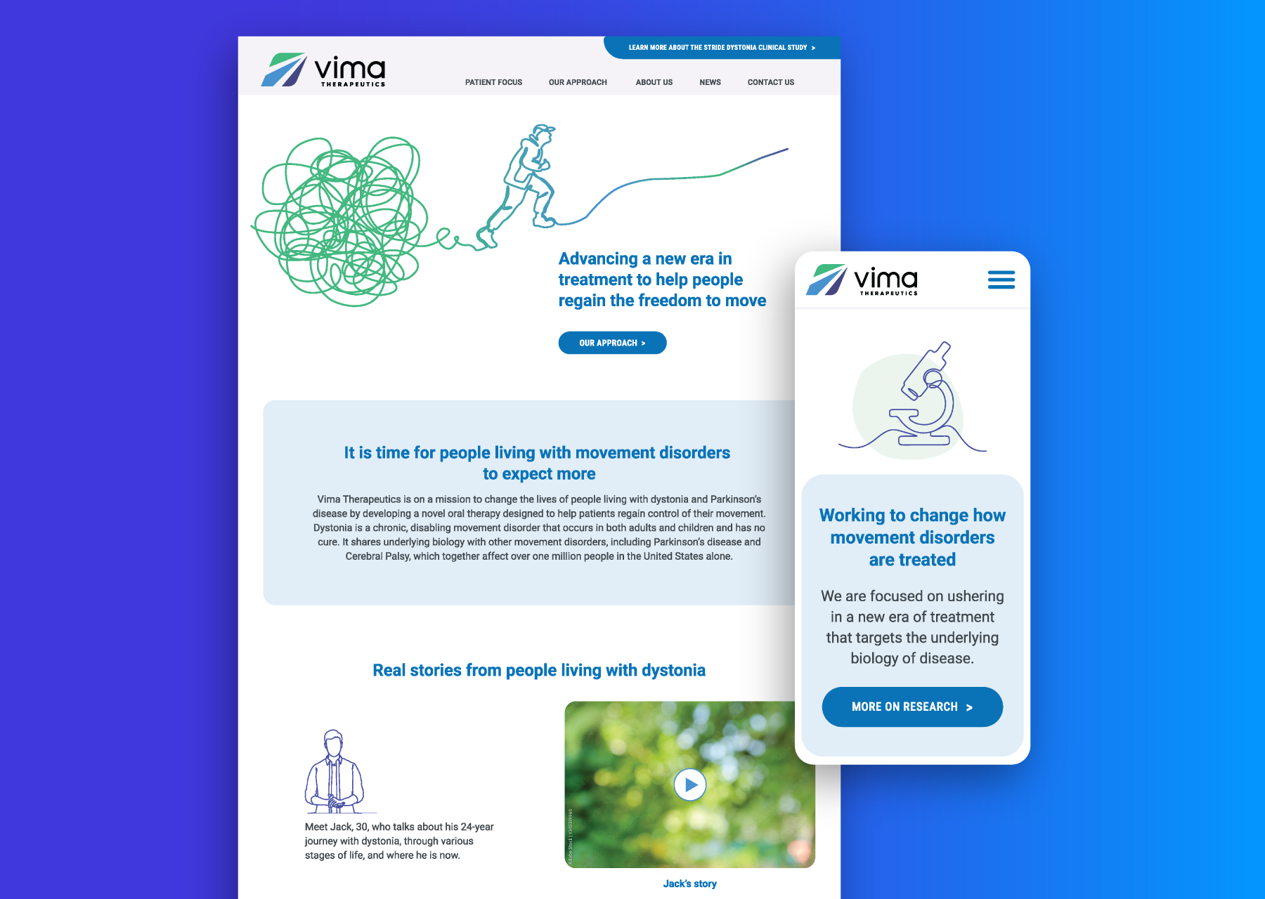
The updated home page and supporting sections delivered a more confident, credible portrayal of Vima’s mission and progress. Overall, the new design elevates brand credibility and significantly improves accessibility and usability (especially for people with dystonia) without sacrificing the friendly, human tone of the Vima brand.
october 2025-march 2026
key responsibilities:
user experience
user interface
responsive design
deliverables:
design documentation
high fidelity mockups & prototypes
prioritizing accessibility for patients with movement disorders
Throughout the project I advocated for accessibility considerations. I proposed larger buttons, generous line spacing, and bigger body text to support users with dystonia who may experience involuntary movements.
I also established clear, scannable sections with strong headings and descriptive CTAs so visitors could find clinical study details, resources, and company information with minimal effort.
home page
before & after
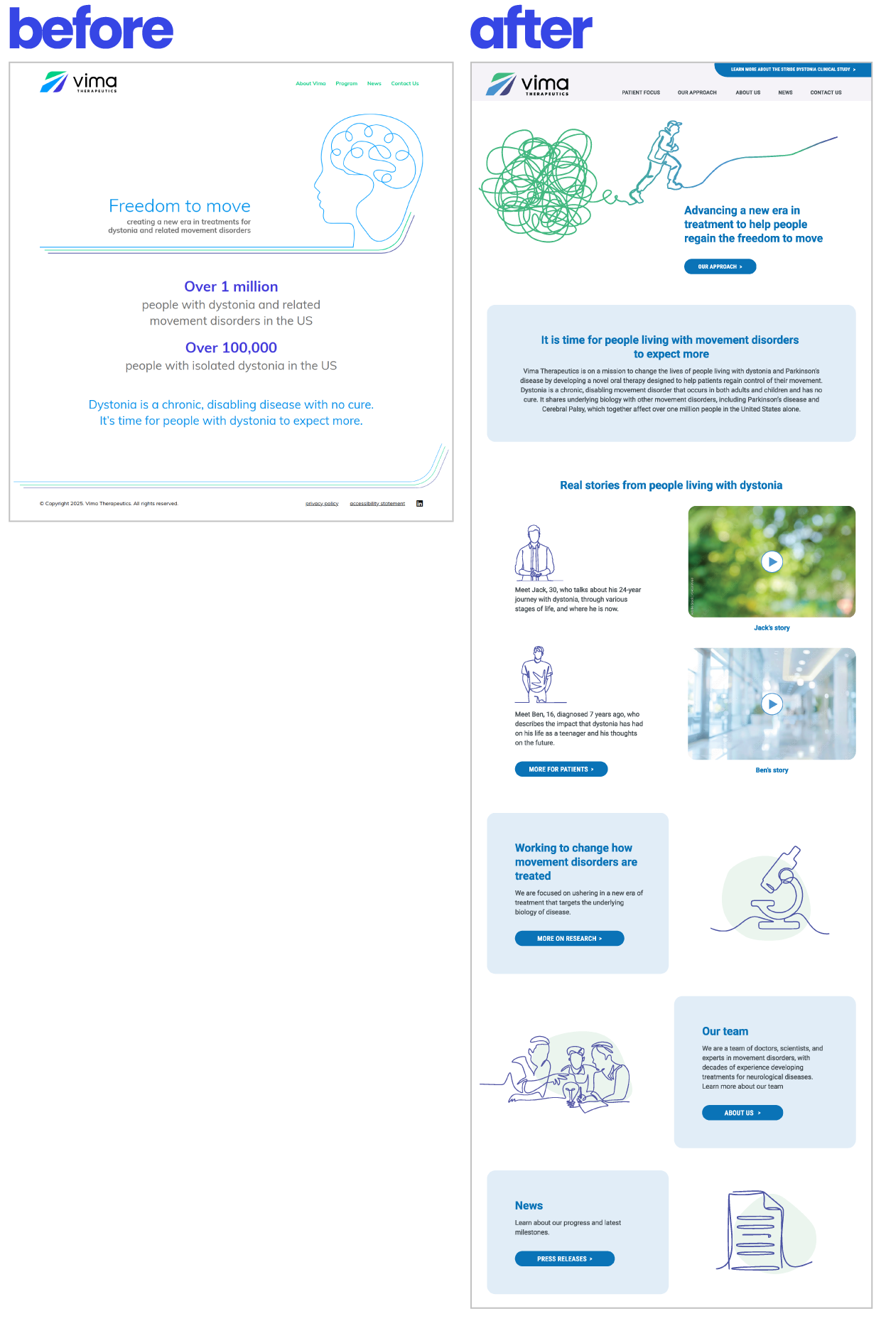
Before: barebones and hard to grasp the dystonia narrative
After: patient-focused and clear calls to action
The redesigned home page centers a crisp, patient-focused narrative with a clear progression from problem to solution.
It uses a bold, approachable layout, stronger typography, and visually distinct sections that highlight the Stride study, patient stories, and the Vima team. The hero conveys movement and hope, while the supporting blocks concisely present the disease context and calls to action.
Considerations included:
larger, high-contrast buttons for accessibility
easy-to-read card patterns for resources and news
simple page layouts that reduce cognitive load