ui/ux for a new pharma product
About my work for Verastem’s new drug, Avmapki Fakzynja Co-Pack
To ensure clarity, consistency, and accessibility for both distinct user groups, I anchored the whole project in a robust Figma component library. This library gave all team members a single source of truth for layouts, typography, color, iconography, and interaction components, allowing for quick iterations.
Unified components meant handoffs from Figma to code were as close to frictionless as possible. Devs could inspect components, copy styles, and reference usage guidance directly in Figma using the robust library I built out. When clients made last-minute content or color requests, those changes were updated once in the library, then cascaded instantly across all page variants. The result: streamlined design-to-development workflow for web and emails, cutting cycle time by 40% and reducing designer–developer iteration by 60% through clear spec handoffs and component reuse.
AUG 2025-CURRENT
key responsibilities:
user experience
client collaboration
prototyping
responsive design
deliverables:
design documentation
high fidelity mockups & prototypes
asset library repository
style guide
patient site and healthcare professional site
The patient website and the healthcare professional (HCP) website for Avmapki Fakzynja Co-Pack are each designed around the distinct goals and needs of their respective audiences, resulting in clearly differentiated information architecture.
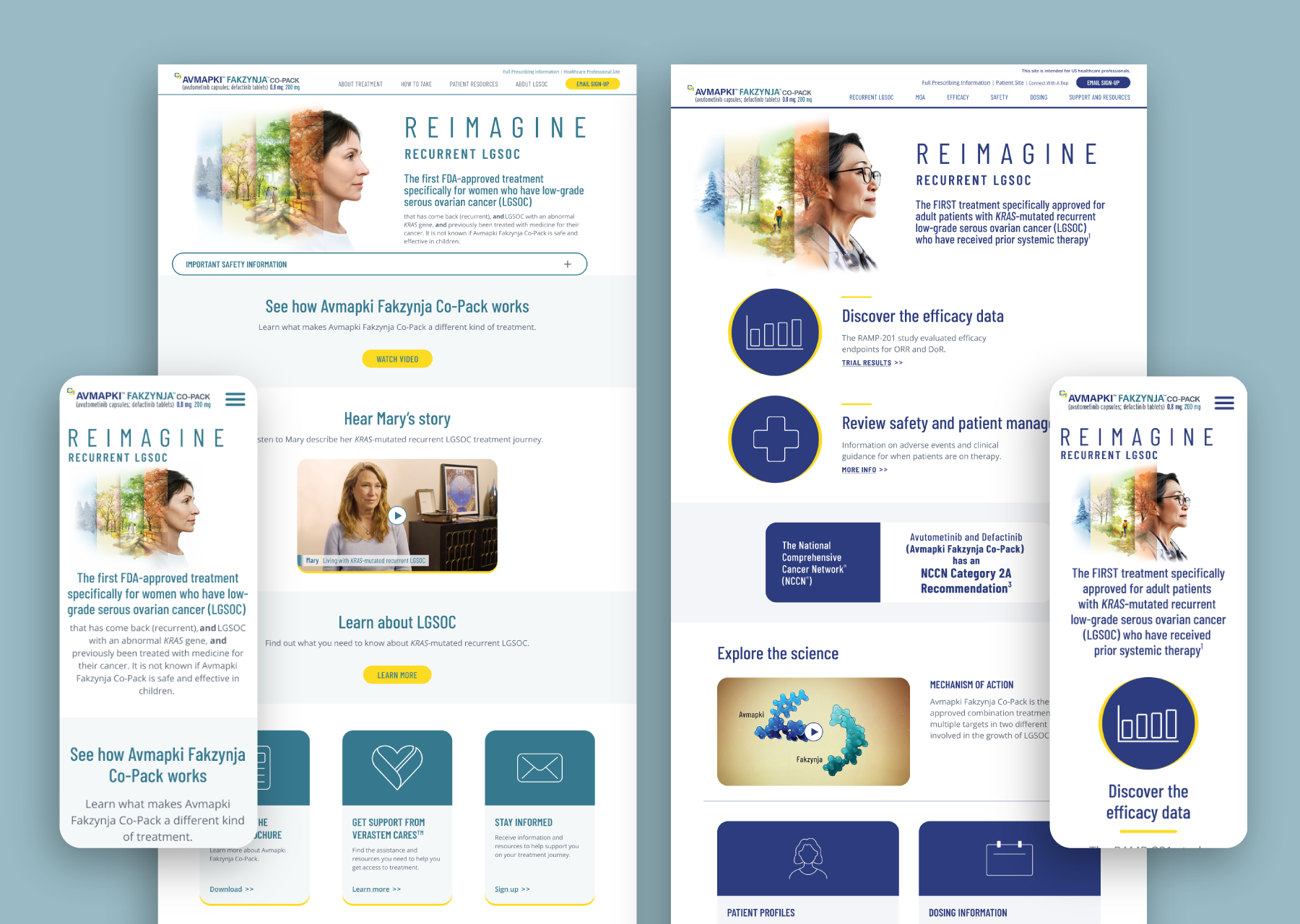
Patient Site Information architecture:
Guided, Linear Flow: The patient site uses a straightforward, step-by-step structure to minimize cognitive load and help users easily find essential info.
Simple Top Navigation: Navigation is grouped around patient concerns: About Treatment, How to Take, Patient Resources, About LGSOC, with clear action items like “Email Sign-Up.”
Support and Education Emphasis: Homepages and key sections lead with reassurance, stories, explainer videos, FAQs, downloadable patient guides, and support services.
Prominent Safety Information: Safety is persistently emphasized via banners and repeated ISI content, supporting both comprehension and regulatory compliance.
Call to Action Oriented: Each step encourages next actions, whether learning, downloading, or contacting support, with minimal distractions.
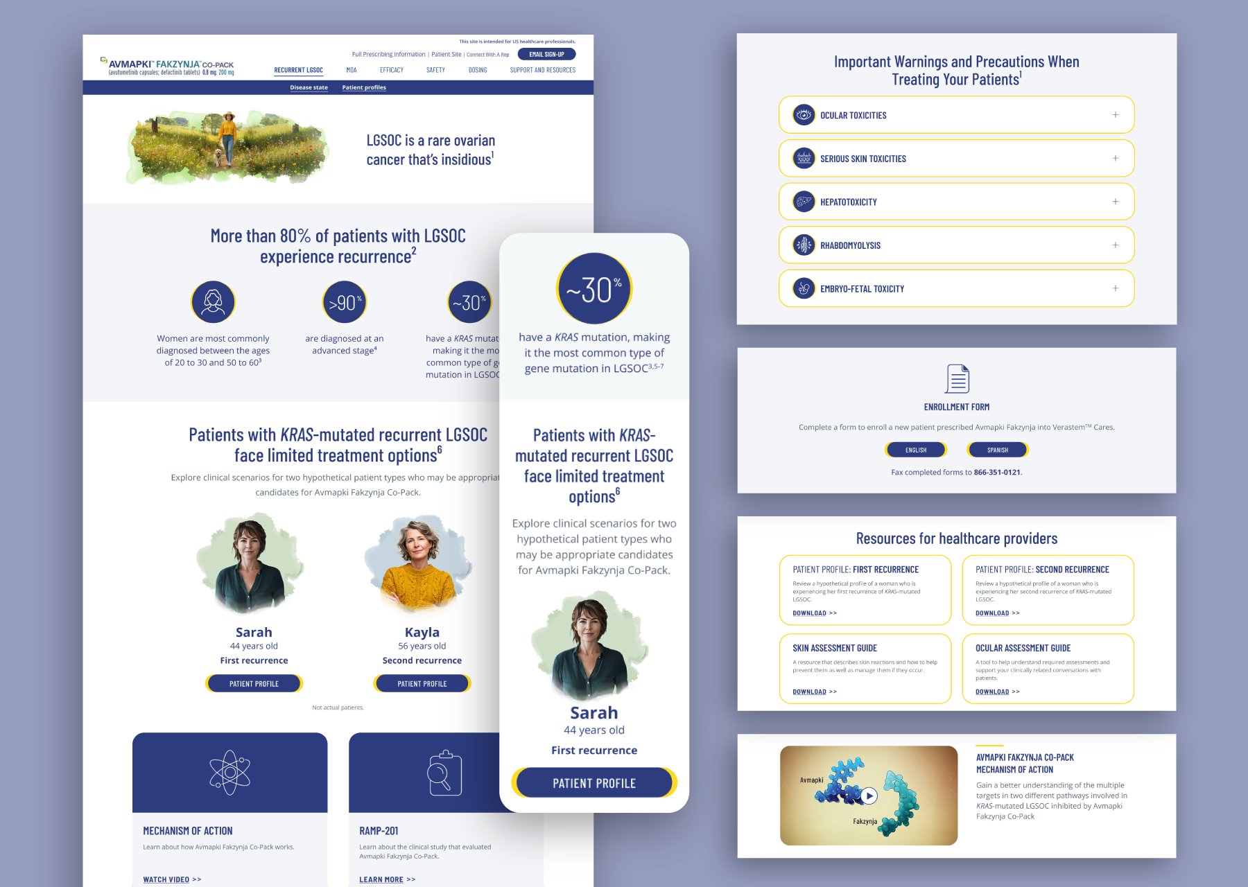
healthcare site Information architecture:
Reference-First, Deep Content: The HCP site is optimized for rapid access to detailed, clinical information with denser content per page and cross-linking for reference use.
Functional Navigation: The nav bar maps directly to clinician workflows—Recurrence LGSOC, MOA, Efficacy, Safety, Dosing, and Support/Resources—mirroring the way an HCP would look up or reference clinical information.
Expandable, Data-Rich Sections: Dense tables, dosing charts, warnings, adverse event detail, and downloadable prescribing documents are prioritized, supporting complex decision-making.
Regulatory & Clinical Emphasis: ISI, references, indications, and footnotes are integrated throughout, often at the top of page or locked in view, per regulatory demands.
Distinct Segmentation: Patient resources and HCP tools are distinctly separated, ensuring clarity between what to share with patients and what drives clinical action.